Project Overview
Oak & Age
Skills: Branding, design, videography
Tools: Adobe Creative Cloud
Client: Personal / Oak & Age
Oak & Age focuses on creating entertaining and informative content about whisk(e)y, cocktails, and other spirits, with an emphasis on professional-grade production value. I created branding guidelines and a visual identity which helps set the tone for the production value before anyone even consumes any content. Below is an in-depth look at the challenges I faced and the decisions I made to help Oak & Age live up to my expectations of high production value.
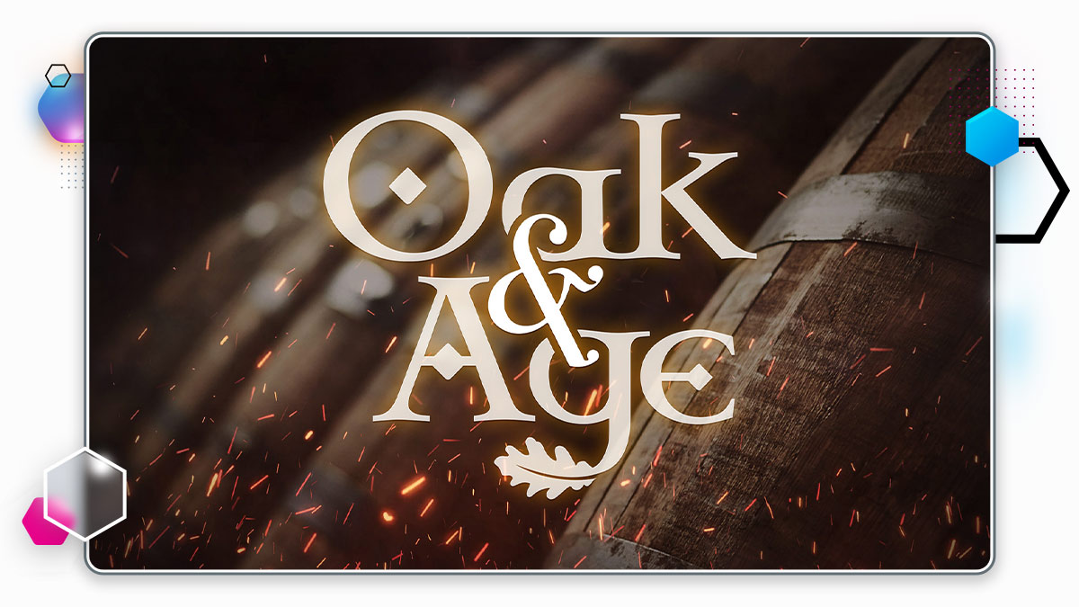
"Oak and age" - it's all in the name. These two elements are very important for whisk(e)y. The water of life owes most of its character to the process of being aged inside of oak barrels. I began with the creation of a logo with intent for it to be stylish and memorable. I needed to ensure it could neatly fit a 1:1 aspect ratio to account for the vast majority of use-cases on social media channels.
As a base, I modified a Celtic-style font, which I felt payed homage to the birthplace of whisk(e)y. It also serves as a visual representation of 'age', since the letters have an old-timey vibe. The descender of the 'g' character has been made into an oak leaf as a nod to the wood. A stylized ampersand binds the words "Oak" and "Age" together.
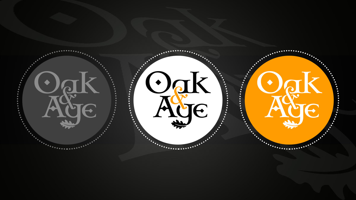
Once I was happy with the logo, I turned my attention to finding a colour palette for the branding. Since whisk(e)y tends to have a beautiful amber colour when in a glass, I naturally found myself gravitating towards the orange spectrum for Oak & Age's primary colours. Blue hues would compliment it nicely, given their relationship in colour theory. This sparked (pun intended) the idea of employing sparks and smoke as a design element. A perfectly fitting visual, since whisk(e)y barrels are often charred inside, and smoke is among the many flavour characteristics found in whisk(e)ys all over the world.
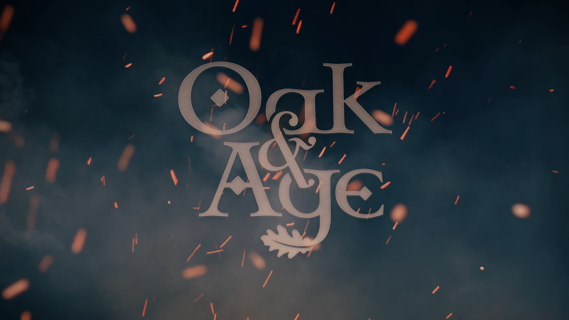
The primary focus of Oak & Age to produce video content, so a unifying intro would be a useful tool for bringing different videos and themes together, further cementing the brand identity. My goal was to create something cinematic and epic, so I came up with the concept of the logo pushing through a veil of smoke and flame to be fully revealed.
I sourced a variety of stock footage featuring plumes of smoke and rising sparks. Using Adobe After Effects, I composited the footage, applied colour correction, adjusted the playback speed of individual elements, and added additional layers of smoke and texture. I applied a bit of extra detail and depth to the logo, to make it feel like it was a 3D object that existed in this made up world, and then it was masked off using cloud texture and animated in a way that would allow it to be slowly revealed. A subtle wiggle was applied to the overall composition to make the whole scene appear more organic, almost like someone with a hand-held camera was capturing the action.
Lastly, I sourced some music that had Celtic / folksy roots, again paying homage to the birthplace of whisk(e)y. To complete the scene and make it all come together, I added some "whooshy" sound effects and crackling noises, which made the sparks and smoke seem all the more real.
The final result was better than I had even envisioned. Something cinematic and eventful, revealing the Oak & Age logo, before disappearing into darkness, and allowing for a lovely transition into other footage.
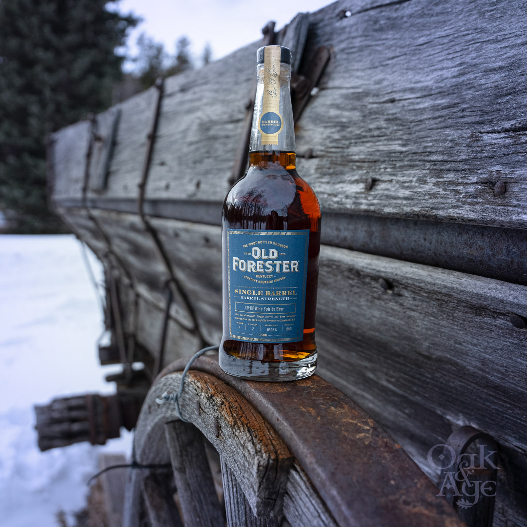
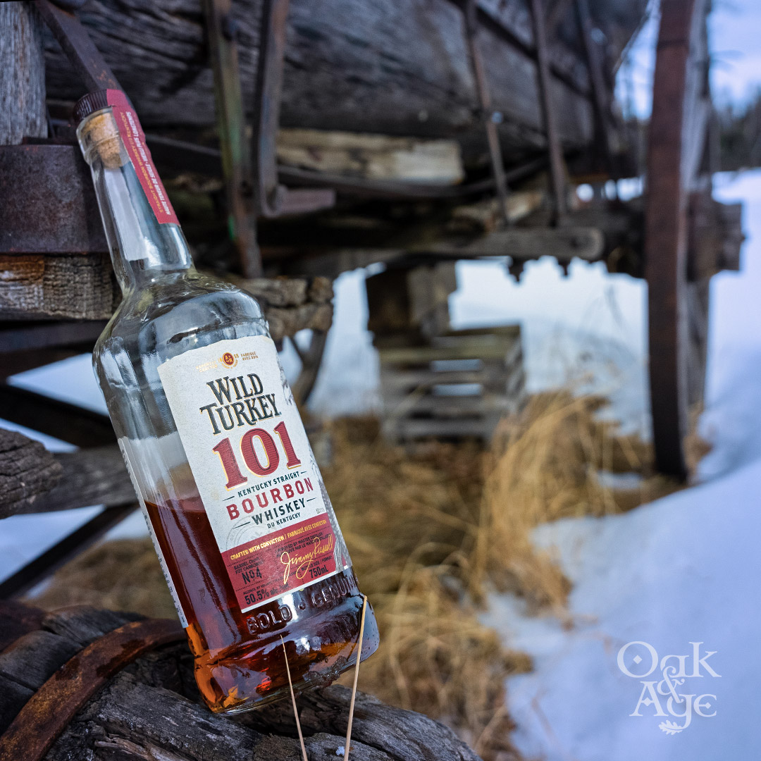
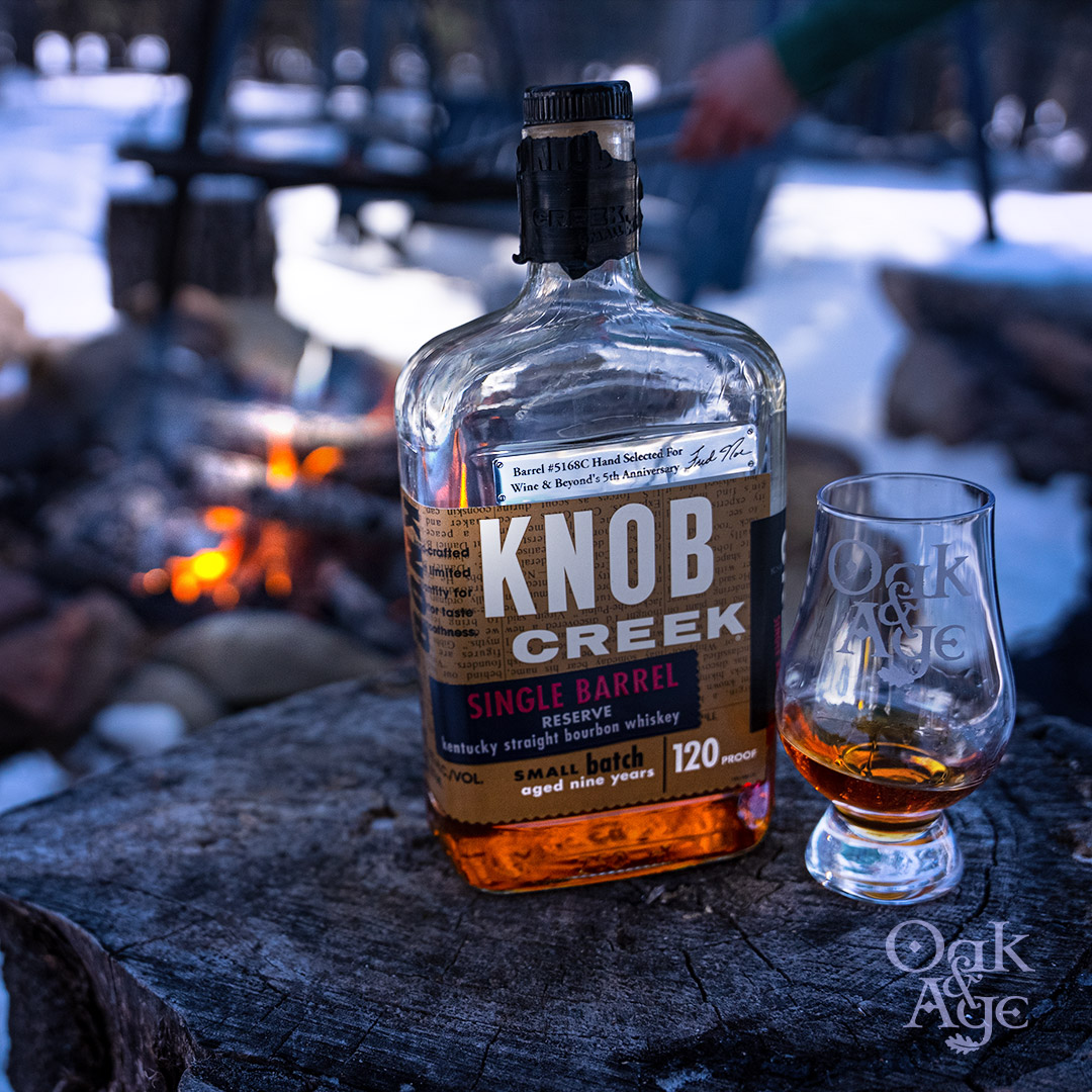
Here are a few examples of video and photography content for Oak & Age
Through distinct branding and a professional online presence, Oak & Age differentiates themselves against other small-scale content creators competing for views in saturated niche.
Hand-coded with love in YYC

 Follow me on Instagram